 is here! Shop now, pay later in 4 easy instalments
The Story Behind Our Tohu

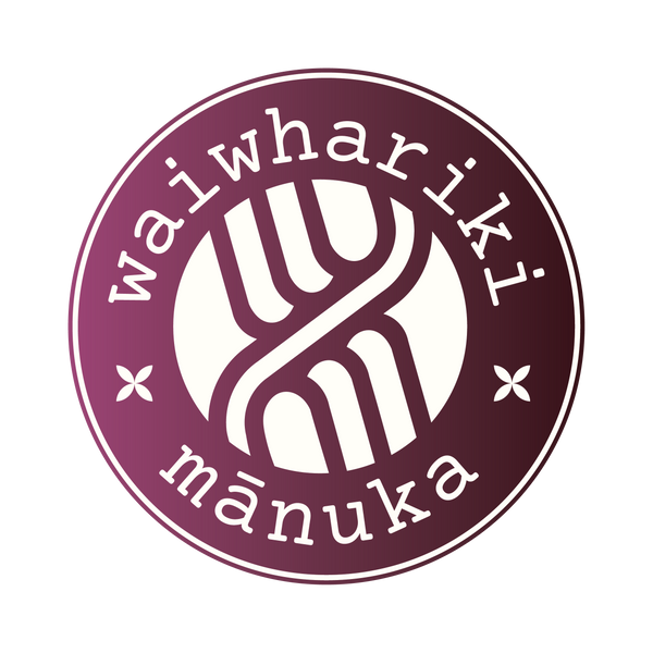
The Waiwhariki Mānuka tohu tells the story of our whenua, our people and our connection to the unique geothermal landscape of Northland, New Zealand. Every element of the design has meaning and reflects the identity, heritage and natural environment behind Waiwhariki Mānuka.
-
Our Geothermal Whenua
The intersecting curve at the centre of the tohu represents the geothermal field beneath our whenua, connecting our brand to the distinctive natural environment where our Mānuka grows. -
Our Six Land Blocks
The three curved lines on each side represent the six land blocks administered by the Ngāti Rangi Ahu Whenua Trust, acknowledging the whenua at the heart of our story. -
The Waiwhariki Name
Waiwhariki is the name of the whenua block where our Mānuka oil distillery is situated, giving our products a direct connection to the land from which they come. -
The Mānuka Flower
The two flower-like symbols beneath the Waiwhariki name represent the delicate Mānuka flower. They also reflect the symbols found beneath the windows of St Michael's Anglican Church, connecting the tohu with our local heritage. -
The Colour of Mānuka in Bloom
The deep crimson colour of the tohu represents Mānuka in full bloom, celebrating the native plant at the heart of Waiwhariki Mānuka.
Together, these elements represent much more than our brand. They tell a story of whenua, heritage, Mānuka and continuity, reflecting where we come from and the values, we carry forward.